
Email Studio gives AET clients the ability to create an email and export HTML or copy the code to launch directly from their CRM.
There are two navigation areas to familiarize yourself with: the left-hand side bar and top-of-the-page nav bar.
-png.png)
Let's check it out starting from the left-hand side bar.
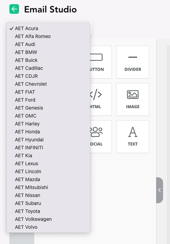
Site selector:
The dropdown site selector allows users to activate rooftop specific sites that are unique for each rooftop account. Once selected, this will activate all templates designs, creative assets, and settings for that specific site/rooftop that you wish to work on.
Left-hand Side Bar Navigation Tools:
Tools are basic content elements that are used to create a design.
Under 'Content', you'll find some of the most common elements for your email. These elements can be added to your email with a simple drag & drop. Let's check out what each does:
-png.png)
Content:
- Columns: Columns is a built-in tool that allows a user to insert columns into their email.
- Button: Button is a built-in tool so users can add buttons to their designs.
- Divider: Divider is a built-in tool so users can add dividers to their designs.
- Heading: Heading is a built-in tool so users can add headings to their designs.
- HTML: HTML is a built-in tool so users can add custom HTML to their designs.
- Image: Image is a built-in tool so users can add images to their designs.
- Menu: Menu is a built-in tool used to create navigation menus.
- Social: Social Media is a built-in tool that lets users add their social media icons to an email
- Text: Text is a built-in tool so users can add text to their designs.
- Video: Video is a built-in tool that lets users add YouTube or Vimeo videos to their emails. This tool automatically generates thumbnails of videos for emails and ensures that it renders correctly on all platforms.
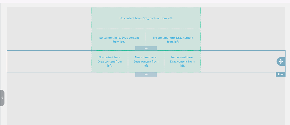
Blocks:
Blocks are a drag and drop feature that allow users to build the basic skeleton for the email template. Once a block is dropped on the template you can assign different content to each of the block columns. Blocks can be moved, duplicated and formatted in different ways to become visible on mobile or desktop views.
-png.png)
Body:
The body selection gives users top level controls of their template to manipulate font type, font color, background color and preheader text. This area will be the master control for basic layout of your designed template.
-png.png)
Uploads:
This area brings in all the images from the specific site media library and dealership logos. Users can also upload additional outside images from their computer to utilize in the email design.
-png.png)
Top Menu Navigation:
Next, we'll move over to the top-of-the-page nav bar.
-png.png)
File Dropdown:
Allows users to open existing saved work, save, override save as new and import existing JSON designs if applicable. The 'Share To' option allows you to share current work to a different site within your AET account. This allows you to be able to reuse work, creating consistency across your whole group.
-png.png)
View Designs: Allows users to open previously save work.
Link Builder: Redirects users to a quick UTM builder for URL tagging.
Send Test Email: Users are able to send a test of their work to an email address to preview what the design looks like in different email environments.
Preview Code: Allows users to preview and manipulate the HTML for the specific design they are working on.
Export HTML: Exports the full design HTML file for your work that can then be embedded in a dealership CRM for email campaign deployment.